Brilliant Botanicals Mural by Rob Fenton & Reiko Kaneko

Client | Brilliant Botanicals |
Artists | Rob Fenton and Reiko Kaneko |
Location | Brilliant Botanicals Murals, Stokeon-Trent |
Completed | 2025 |
Photography Credit | Rob Fenton |
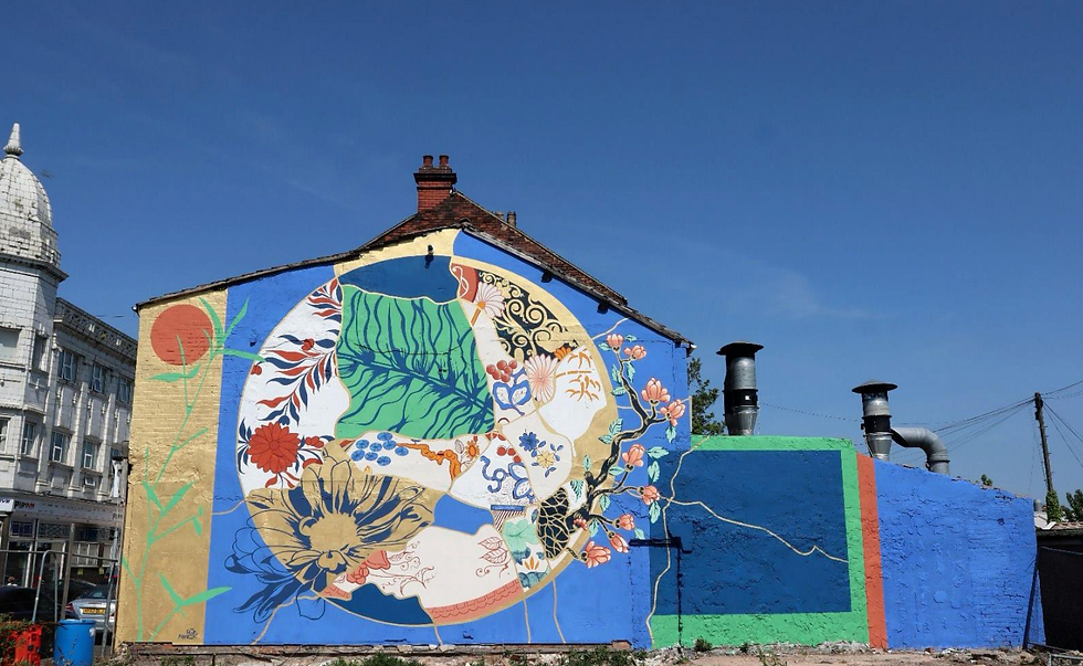
As part of the Brilliant Bamboo programme, artists Rob Fenton and Reiko Kaneko created two striking public murals in Stoke-on-Trent, celebrating the city's rich ceramic heritage and the creative potential of bamboo.
Gemma Thomas, Director of Brilliant Bamboo, worked closely with both artists throughout the project, from developing the initial brief through to refining concepts and providing creative feedback.
She explained:
"We set out to do more than just create something visually impressive. We wanted to celebrate the city's story, connect it with the future potential of bamboo, and stay true to our values around sustainability and community."
The project had several key objectives:
Create beautiful, thoughtful public artworks.
Offer a fresh perspective on Stoke-on-Trent's artistic and industrial heritage.
Connect the city's ceramic history with Brilliant Bamboo's exploration of bamboo as a creative and sustainable material.
Champion more environmentally responsible approaches to public art.

Reiko's mural, located alongside the Stoke canal, features a bold oversized bamboo design, while Rob's mural, positioned near the historic former Spode factory, draws inspiration from Chinoiserie patterns found within the pottery company's archives.
Although each artwork has its own identity, both murals share visual motifs and a coordinated colour palette, creating a cohesive experience across the two locations.
Why Did You Choose KEIM Mineral Paints?
Gemma and Rob were determined to select materials that reflected the environmental values of the Brilliant Bamboo programme.
Rob, who is well known for his large-scale murals, explained:
"I learned that paint makes up 53 per cent of microplastics globally—that blew my mind. It made me realise how important it is to be more conscious of what we're putting into our buildings and the environment."
The team ultimately selected KEIM Mineral Paints because of their technical performance, environmental credentials and suitability for historic brickwork.
Rob continued:
"I hadn't used KEIM before, but the more I learned, the more I realised how perfect it was for this project. We were delivering murals on historic brickwork, and traditional acrylics can flake. KEIM mineral paints penetrate the surface and allow the bricks to breathe—it's an organic product in an organic location."

What Did You Think of Our Paints?
Both artists were new to working with mineral paints and had to adapt their usual techniques—something they embraced as part of the creative process. They also made the conscious decision to share colours across both murals, reducing waste and avoiding unnecessary paint orders.
Rob said:
"The drying time was incredible—I had to completely rethink how I worked, and fortunately the KEIM team are really knowledgeable about their products. Bryan talked me through the dos and don'ts, such as not mixing the paints with water on the wall."
Reiko, whose background is in ceramics and mineral inks, was equally impressed with the results. Although this was her first public mural, she quickly gained confidence working with KEIM Mineral Paints and introduced the idea of incorporating metallic gold into both designs.

What Excited You About Our Colours?
From shimmering gold highlights catching the sunlight to earthy mineral tones inspired by ceramic glazes and the surrounding landscape, the carefully selected colour palette helped connect the murals to both their location and their purpose.
Rob explained:
"You get a real glimmer from the gold as you drive past—it's a beautiful colour. No other company that I'm aware of does a metallic as vibrant as this. When I opened the drum it looked like real gold, like melted bullion."
Gemma added:
"Putting the metallics with the earthy tones was when the project came together. It will be interesting to see how it continues to weather, but we feel it will keep its richness because of the quality of the paint."
A Lasting Impact
The success of the project has reinforced KEIM Mineral Paints as the preferred choice for future Brilliant Bamboo initiatives.
Gemma said:
"This project brought together several of the things we care about most—beauty, sustainability and place. It shows how public art can be joyful, thoughtful and values-led. As a company we can't compromise on our values and the ethos of the project, and if it expands, we'll be advising future artists to use KEIM."
Rob agreed:
"It's slightly more expensive, but it's absolutely worth it. I'll definitely be using KEIM again, and I'll be talking to more clients about it. The actual product is phenomenal and the company was great to work with.This big project was a learning curve for me, but I am very proud of what we created together. It would have looked very different if we had used a traditional masonry paint."
"The actual product is phenomenal and the company was great to work with."


Comments